
The Color of the year is Fluff

Pantone Chose White. And Everyone Missed the Point.
Pantone has named Cloud dancer as the Color of the Year—and for many, it landed like a provocation.
A shock.
A controversy.
A reaction that made people ask: Is Pantone no longer forecasting trends, but manufacturing noise just to stay relevant?
At first glance, choosing white feels almost… lazy. Too obvious. Too safe. Too blank. A move designed to irritate rather than inspire.
But let’s pause and recap—because this choice is far more intentional than it appears.
Historically, Pantone selected the Color of the Year as a prediction: a data-driven synthesis of global trends, cultural shifts, economic signals, and world events. It was never random—it was analytical.
In recent years, however, many would argue Pantone lost its footing. Some choices felt performative rather than prophetic. So when White Cloud was announced, it felt like a flop.
Or was it?
Let’s dig deeper.
What White Actually Represents
In color theory, white is anything but empty:
Elegance & elevated simplicity
Purity & cleanliness (why healthcare, luxury, and architecture rely on it)
Minimalism & modernity
New beginnings & mental clarity
Space & light—white expands rooms and elevates what surrounds it
Neutrality & balance
Spirituality & peace
White doesn’t shout. It creates room.
…And that matters—because the world is loud.
We live in an era of constant noise: wars, breaking news, social feeds screaming for attention, brands competing in volume instead of value. People are overwhelmed.
So where do humans instinctively find peace?
In nature.
In snow.
In clouds.
In quiet.
White as a Signal of Power
Let’s Look at the markets:
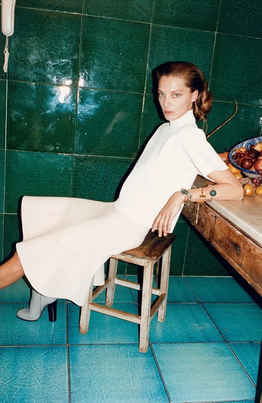
In Fashion:
White is the uniform of quiet luxury. Nothing signals confidence like a perfectly cut white trouser or an effortless monochrome look. It doesn’t need validation.

In Sports & Lifestyle
Snow sports are not accessible for everyone. The barrier to entry is high—boots, skis, suits, destinations. White here is not softness; it’s exclusivity.
Real Estate
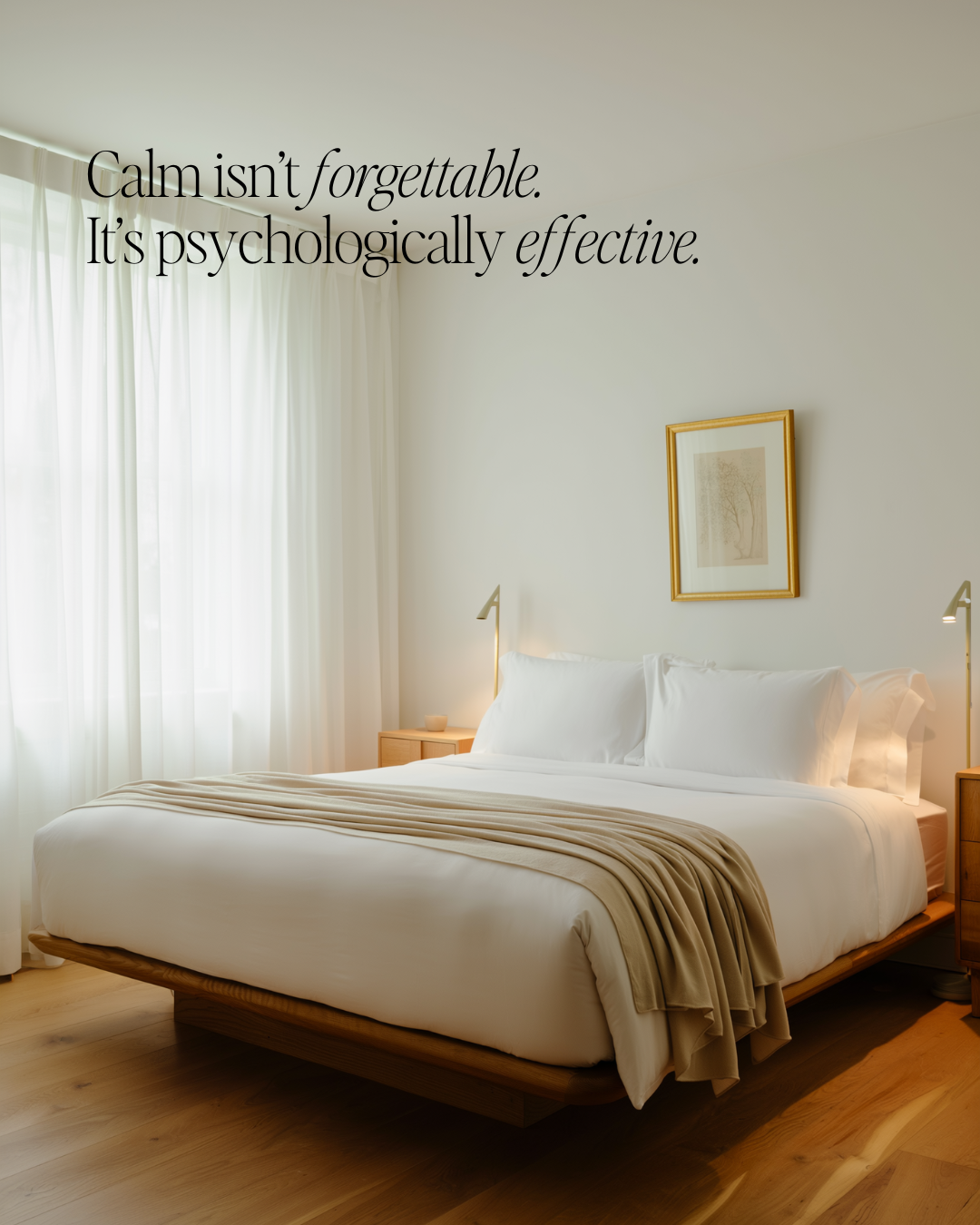
This is where it becomes undeniable.
White sells.
Calm sells.
In a loud world, calm converts.
Walking into a home filled with natural light, uncluttered spaces, and a sense of stillness creates an emotional response that is priceless. Buyers don’t just see a house—they feel possibility.
White also gives confident buyers what they crave most: a canvas. A neutral foundation to project their own identity, lifestyle, and story.
So yes—I’ll say it plainly:
White sells homes at all price levels, with even greater impact in luxury marketing.
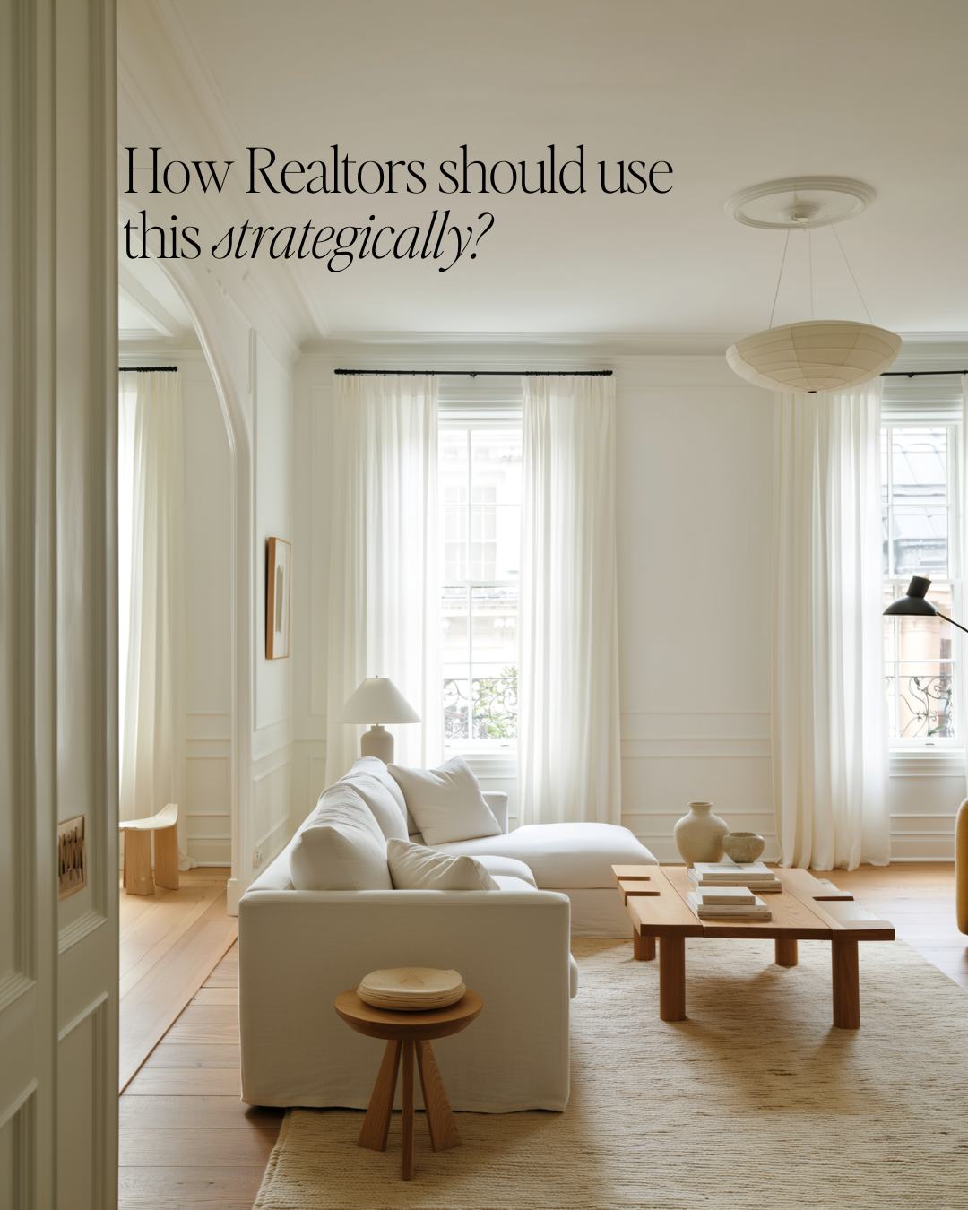
In practice, that looks like:
Natural light as the hero
Minimal, intentional décor
Clean lines and visual breathing room
Include trendy Colors in your palette
Add some contrast with natural woods details
Spaces that feel edited, not empty
Keep it warm, add textures so it doesn’t feel flat
Here’s the Part You Already Know
If you’ve been selling real estate for any amount of time, none of this is new.
You’ve advised clients to paint walls white.
You’ve invested in staging.
You’ve curated environments that feel calm, light, and aspirational—because they work.
…What you haven’t been taught is how to translate this philosophy into your brand.
Instead, the industry has told you that visibility requires noise. That the only way to market yourself is to perform—dance, joke, overshare, chase trends, become an influencer.
I’m here to challenge that.
Your marketing doesn’t have to be loud.
It has to be aligned.
There is no more digital footprint.
Your clients are informed, discerning, and highly perceptive. They are validating you before they ever call you.
And it’s time your brand reflects the same clarity, restraint, professionalism, and expertise that already define your work.
White isn’t absence. It’s confidence.